What is a style guide and why using it?
What is a style guide and why using it?
Why is a style guide so important?
As its name indicates, it is above all a guide. It will include the recommendations of use and the characteristics of the various design elements such as: the logo, the colors, the typographies and fonts used, the iconographic symbols etc.
These elements will be used in the different communication materials of the company.
Having a well-made style guide is the key to guarantee homogeneity and coherence in the internal and external communication of a company. It makes a company recognizable by its consumers / users.
A good style guide will allow you to widen your notoriety, to be the top-of- mind brand when a customer needs to make a purchase to benefit from a spontaneous notoriety.
How can we build a good style guide? What are its components?
1- The moodboard
Before building your visual identity, you must define your universe. For this we advise you to use a Moodboard. It is an assembly of images, objects or words that will be used to express the style you have chosen in the development of your creative idea (product concept, advertising, design, layout, etc.).
The moodboard can be used by a designer to show the orientation or the thematic universe of his creative work. It can also be used to guide the work of a team or candidates in a creative crowdsourcing project.
To summarize, a moodboard will not only be limited to visual themes, but it will also be used as a tool to quickly inform others of the spirit or mood the designer is trying to achieve. Creating moodboards in digital format is generally faster and easier. Below is an example with our own moodboard for the Dubchies:
The Dubchies' advice:
Don't hesitate to do some research, which means looking beforehand at everything that surrounds you and will likely give you some ideas:
- magazines such as: Vogue, Fashion, Bazar etc.
- websites such as: Blog du Modérateur, Behance and especially Pinterest on which you can already find a large choice of moodboards
- it can also come from discussions between friends and family, from advertisements seen in the street, the subway etc.
The key word: draw inspiration and then think of ways to organize it
2- Photographs
Photographs are part of our daily life and are all around us on catalogue, screens, walls, packaging. They represent the world we perceive. However, they are also called "mental" images: they can be concepts, ideas or representations.
Photographs are also used as tools of communication because "a picture is worth a thousand words". This is something that the brands understood. Let’s take the example of the chocolate brand Ferrero Rocher. The graphic design of its commercials uses photographs from the universe of mythology and gold. It helps create a link with the text / music and make explicit the information presented in a layout / advertisement by adding a meaningful connection such as "make moment golden".
For the Dubchies, the photographs included in our style guide allow us to talk about what we share as content without the need to add information, see below:
The Dubchies' advice:
If you are newbies like us, you will probably not be able to afford the services of a photographer.
No worries, many websites called "image and video banks" offer affordable images, such as: DreamStime and Deposit Photos.
Nevertheless, in order to humanize your company/brand we advise you to have your employees, your premises and even your customers photographed!
For bloggers, share your meetings!
3- The color guide
If someone shows you the color red and asks you to associate it with a brand, what would your answer be? Surely, Coca-Cola.
Our lives are guided by colors, sometimes without us noticing it. When you go to the supermarket, you will go to the blue aisle if you want fresh and seafood. Colors are one of the dominant elements of your style guide.
With the emergence of the web, the color palette available on computers has continued to grow. Companies now have a wide range of colors to choose from.
We can ask ourselves, why, depending on the areas of expertise of companies, will we generally find the same color codes?
It is important to take into account that the perception of colors is unconscious, intuitive, that it conveys a specific message. For this reason, it is important to choose the palette that perfectly matches your activity but also the values you want to spread.
However, we must not forget that the perception of color can also have a negative connotation or a different interpretation depending on the country we are in.
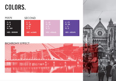
For the Duchies, we chose black as the dominant color and 3 secondary colors that symbolize us.
The black underlines the mystery behind the Dubchies but above all the determination in which we have undertaken this journey.
The red (which symbolizes Maud) is the one that will attract attention.
The purple (which symbolizes Emma) is the color of the dreamers.
And the pink (which symbolizes Anais) although is a mischievous color, it will evoke femininity and softness.
The Dubchies' advice:
Your graphic design should be made up of three colors maximum (preferably).
You can draw inspiration from many websites such as: Coolors, which is a generator of color palettes ultra-easy to use and / or the website Colordot which offers an original way to explore a color palette. You can discover hexagonal colors in a really intuitive way.
Make sure to reinforce your message with the choice of the colors and not contradicting it.
4- Typography
Typography is important for brands, thanks to it they can be recognizable on all their communication supports. Thus, some companies such as Apple, Audi, IBM or the NGO Amnesty International will have their own typography.
To choose the perfect fonts, you will have to take into account your field of activity as well as your target. It makes sense that a baker will not communicate with the same font as an international brand such as Pepsi.
So, think about establishing a precise typography (2 maximum): with two to three fonts for: the title, the subtitles and for the text content, as you can see below:
The Dubchies' advice:
For the last few years, the trend has been towards simplicity. Many brands have already adopted this approach by simplifying their visual identity such as Burger King in early 2021 by opting for FlatDesign. A logo and a typography now uncluttered, without cumbersome elements, simple forms that seek to gain visual impact.
A new challenge that brands have to take into account in their style guide is to remain visible, recognizable and impactful regardless of screen size.
5- The logo
We had previously talked about the importance of colors and typography in the style guide. However, these two elements are not enough to think about the logo, overall.
It is also necessary to take into account how the logo will be integrated into the various supports on which it will be used.
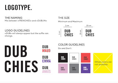
You must be able to explain in a clear and precise way how you wish your logo to be implanted according to its various environments for which it is intended. This is how we created our logo that you can see below:
Thus, you should be able to determine:
- The dimensions
You must write instructions regarding the dimensions of your logo and especially the minimum and maximum dimensions.
- The space
This is the space around your logo also called "living space". You must write instructions to know if your logo requires more or less space.
- The colors
First, you need to imagine your logo in different possible variations such as negative, color and especially black and white. You must also add the explanations concerning the use of the different variations.
- What not to do
This is clearly the most important part, it will allow you to write down and illustrate all the things forbidden regarding your logo.
The last tip of the Dubchies:
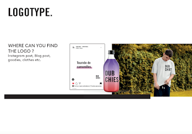
Don’t hesitate to use your logo in different ways! As you can see above with our logo, we built it in a way to be able to use it for other purposes and specially to have a funnier look.
As you probably want to have a strong brand image with a logo that can be used everywhere, you need to create a logo that can be declined. This often means that your logo will appear in several versions, so it should always look its best, whether it is print or web. Flexibility is also one of the main criteria of a good logo.
"THE FINAL WORD”
Not all graphic charters are endless paving stones. Some even fit on a single page. It all depends on your business and its needs. The important thing is that it contains all the information relevant to your brand that will then be used as a reference for all your future projects.
Maud Notredame


Hi Dubchies!
ReplyDeleteOnce again you wrote an interesting article. It will be very useful for me in order to create the perfect universe and therefore style guide for the brand I am working on.
I was wondering, is this smoothing of the logos, which has become a real fashion phenomenon, the right step to take? Wouldn't we lose a bit of personality and soul?
Because I noticed that a lot of brands are reshaping their visual identity, especially their logo, but I think this could be useless regarding the differentiation on the market.
It is always a pleasure to read you!
Have a nice day!
Hi Nini!
DeleteThank you for your great loyalty since the beginning!
You are right! The trend is the simplicity today, by using most of the time the flat design. However, we can ask ourselves about the relevance and the effectiveness of this shift.
It could be, simply, a come back to the old time with a minimalist logo. But it could be also perceived in a more controversial way regarding the way that brands differentiate themselves on the market.
The reality is that we can debate for hours about this trend, it has its advantages and its limitations.
I hope we have answered well to your comment!
Thank you!
Dubchies
Hi Duchies!
ReplyDeletethankyou so much for sharing this wonderful article.
the article is interesting. I also liked the design of the documents and components which makes the blog very interesting. The pictures are also used in an appropriate manner.
So much fun and easy to read.
have a good day!
Many thanks for this article! It helped me to understand the concept of style guides better!
ReplyDeleteHave a nice day,
Good luck
Hi!
ReplyDeleteGreat article! It is so true that for a company to have efficient and relevant communication (internal and external), having a well-made style guide is important. Indeed, it helps to create a brand image so that everybody can see and recognize it. Moreover, when we hire someone for a communication campaign, for example, having this style guide ready will make the work more efficient and we will more likely save money by saving time since all the imagination of the brand’s identity is already done. I remember working for a company in France and we had to change some pages on the website. When I contacted the designer, he gave me a very high quote and after sending him the style guide and wireframes of the new webpages, he decreased the quote because a big part of the job had already been done. Those tools can be very powerful, especially for small companies with a limited budget.
I always enjoy reading you, have a good day!
Anaïs